Google created the Roboto font, which is a sans-serif style font. This font has been available since the early days of Android 4.0 (Ice Cream Sandwich), and it has the advantage of being elegant and visible on high-resolution screens such as those found on Android phones.
Roboto contains a plethora of typefaces (including regular, bold, italic, italic, and bold) and is primarily used on system applications and all Google applications.
There is good news for font lovers: Google developers have made the Roboto font available for free, and you can use it without restriction (under the Apache Software License). So you can now use it completely on Windows.
What is Google Roboto Font?
Roboto is a sans-serif font family created by Google in 2011 to be used as the default font in its Android 4.0 “Ice Cream Sandwich” operating system, which is currently free and open source. This font family includes a variety of weights and strokes, allowing each user or developer to tailor it to their specific needs. It is a simple font with small endings or trims that is especially recommended for use on screens to avoid overloading or tiring the eyes and make it easier to read.
Who is Roboto Developer?
Google LLC is a multinational technology company based in California that specializes in search engine technology, online advertising, cloud computing, computer software, quantum computing, e-commerce, artificial intelligence, and consumer electronics. Because of its market dominance, data collection, and technological advantages in the field of artificial intelligence, it has been referred to as the “most powerful company in the world” and one of the world’s most valuable brands.
Why Install Google Roboto Font?
Roboto, like the rest of the Google Material Design components, has all of its documentation online. As a result, Android or website designers have access to a wealth of information, such as which styles and sizes to use, what line height to use for proper readability, and other suggestions. to understand how to use colors All of these sizes, styles, and rules were created to balance the density of the content with the comfort of reading the font.
How to Install Google Roboto Font on Windows PC
Here are the steps of How to Install Google Roboto Font on Windows PC for you to read and follow. Follow the provided steps carefully.
- The first step in installing this font is to obtain it from the Google font platform. On this page, we simply click the “Download Family” button, which will open a Windows Explorer window in which we can specify where we want the ZIP file containing it to be saved and then click “Save.” The download will take place on its own.
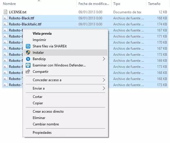
- After downloading the font to our computer, we must unzip the ZIP file. This will result in multiple TTF files, one for each type of font we have (bold, italic, fine line, etc.). Once uncompressed, the only thing left to do is select all of the fonts we extracted from the compressed file and, with the right mouse button, select the “Install” option so that Windows installs them in the operating system.

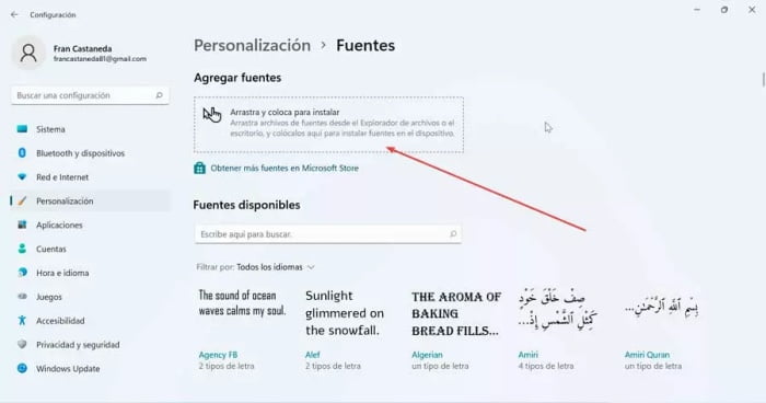
- Another method is to open the Settings menu with the keyboard shortcut “Windows + I” and navigate to the “Personalization” and “Fonts” sections. The extracted fonts are then dragged into the installer window. The Google Roboto font will be installed in Windows in a few seconds, and we can select it just like any other font.

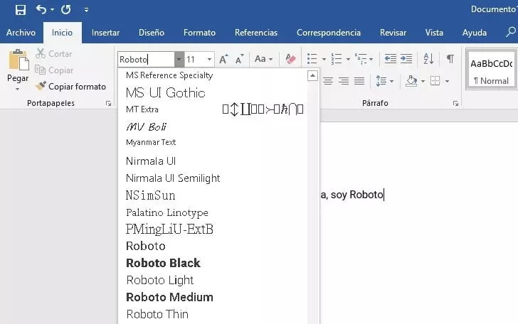
- After installing the fonts, the only thing left to do is close and reopen (if they were previously open) the applications where we want to use this new font. For example, if we now try to change the font in Word, we can see that this new font is already available for us to select and use.

It is a geometric Sans Serif typeface designed by Argentine graphic designer Julieta Ulanovsky and released in 2011. It was inspired by old posters and signs from Buenos Aires’ traditional neighborhood of Montserrat, thereby rescuing the beauty of urban typography from the first half of the twentieth century. This entire family was redesigned by Jacques Le Bailly, who created a lighter version that was optimized for use in longer text. As a result, it has evolved into an excellent choice for blogs and web pages.


